
Suggested replies report
Overview
The Suggested replies report gives you a comprehensive overview of your suggested reply usage, allowing you to identify trends and understand team adoption rates. Use these insights to optimize workflows, identify areas for further training, and evaluate the overall impact of the suggested replies feature on team efficiency and productivity.
Report sections
Key metrics chart
Features
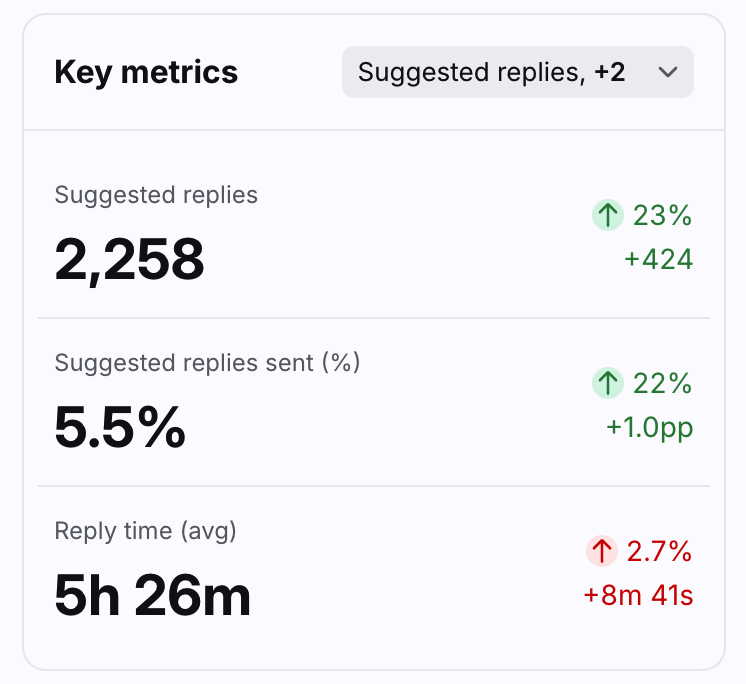
Up to three key metrics cards are featured here to help you understand your suggested reply usage at a glance.
Click the dropdown at the top right of this section to select which metrics you want to display, listed below.
Each card displays the name of the metric, the current measurement, and the variation compared to the previous period of the same length.
Variations for metrics in percentages are shown in percentage points, which is the arithmetic difference between two percentages. For example, moving down from 36% to 34% is a decrease of 2 percentage points.
Click on each metric to see the metric details and list of conversations counted in the metric.
List of metrics
Suggested replies over time graph
Features
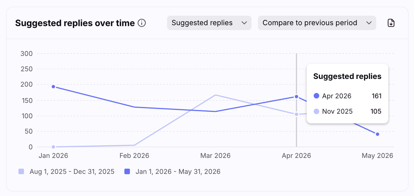
The Suggested replies over time graph allows you to see peaks or drops to help you identify trends in suggested reply usage.
Click the metrics dropdown at the top right of this section to select which metrics you want to display, listed below.
Click the Compare dropdown at the top right of this section and select Compare to previous period to display values from the previous period.
Hover over points in the line graph to see the selected metric for each time increment.
Click on a point on the line graph to see the metric details and list of conversations counted in the metric.
List of metrics
Suggested replies by teammate table
Features
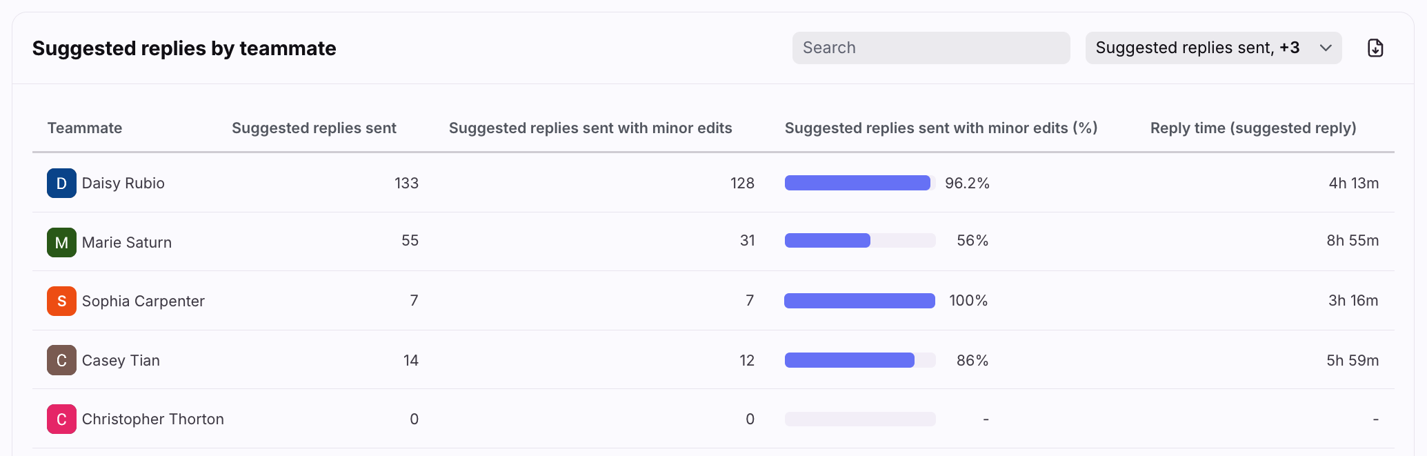
The Suggested replies by teammate table contains all teammates that used suggested replies in the conversations selected using the report filters.
Use the search bar to find a specific teammate.
Click the dropdown at the top right of this section to select which metrics you want to display, listed below.
Customize how many rows you'd like to display on each page using the Rows per page on the bottom left.
Click the arrows and numbers on the bottom right to view additional pages.
Click on each metric to see the metric details and list of conversations counted in the metric.
List of metrics
Pricing
As of April 28, 2026, this feature is available as part of the Autopilot add-on. Customers with legacy access may continue using the feature until their next renewal date or upon 30 days' advance written notice.