
Customer satisfaction report
Overview
The Customer satisfaction report shows your impact and efficiency with your customers that you have interacted with during the selected time period, including the volume of messages and reply times. You can view both customer CSAT survey scores and Smart CSAT scores in the same report.
Take a Front Academy course here to learn more about leveraging Front analytics to achieve your goals.
Report sections
Key metrics chart
Features
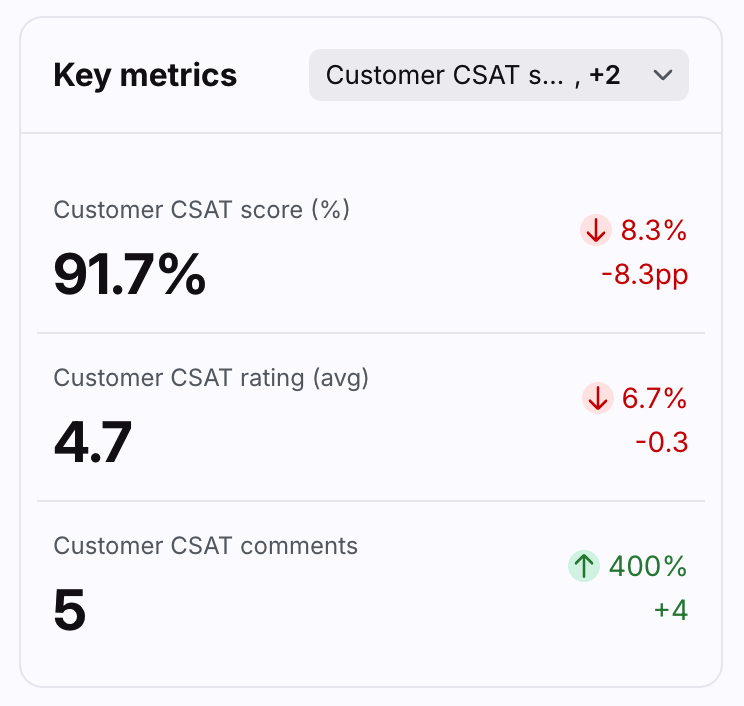
Up to three Key metrics cards are featured here to help you understand your efficiency at a glance.
Click the dropdown at the top right of this section to select which metrics you want to display, listed below. You view your data by overall satisfaction, submitted by customer (customer CSAT), or inferred by AI (Smart CSAT).
Each card displays the name of the metric, the current measurement, and the variation compared to the previous period of the same length.
Variations for metrics in percentages are shown in percentage points (“pp”), which is the arithmetic difference between two percentages. For example, moving down from 36% to 34% is a decrease of 2 percentage points.
Click on each metric to see the metric details and list of conversations counted in the metric.
List of metrics
Customer CSAT score
Customer CSAT rating
Customer CSAT reviews
Smart CSAT score
Smart CSAT rating
Smart CSAT reviews
Ratings chart
Features
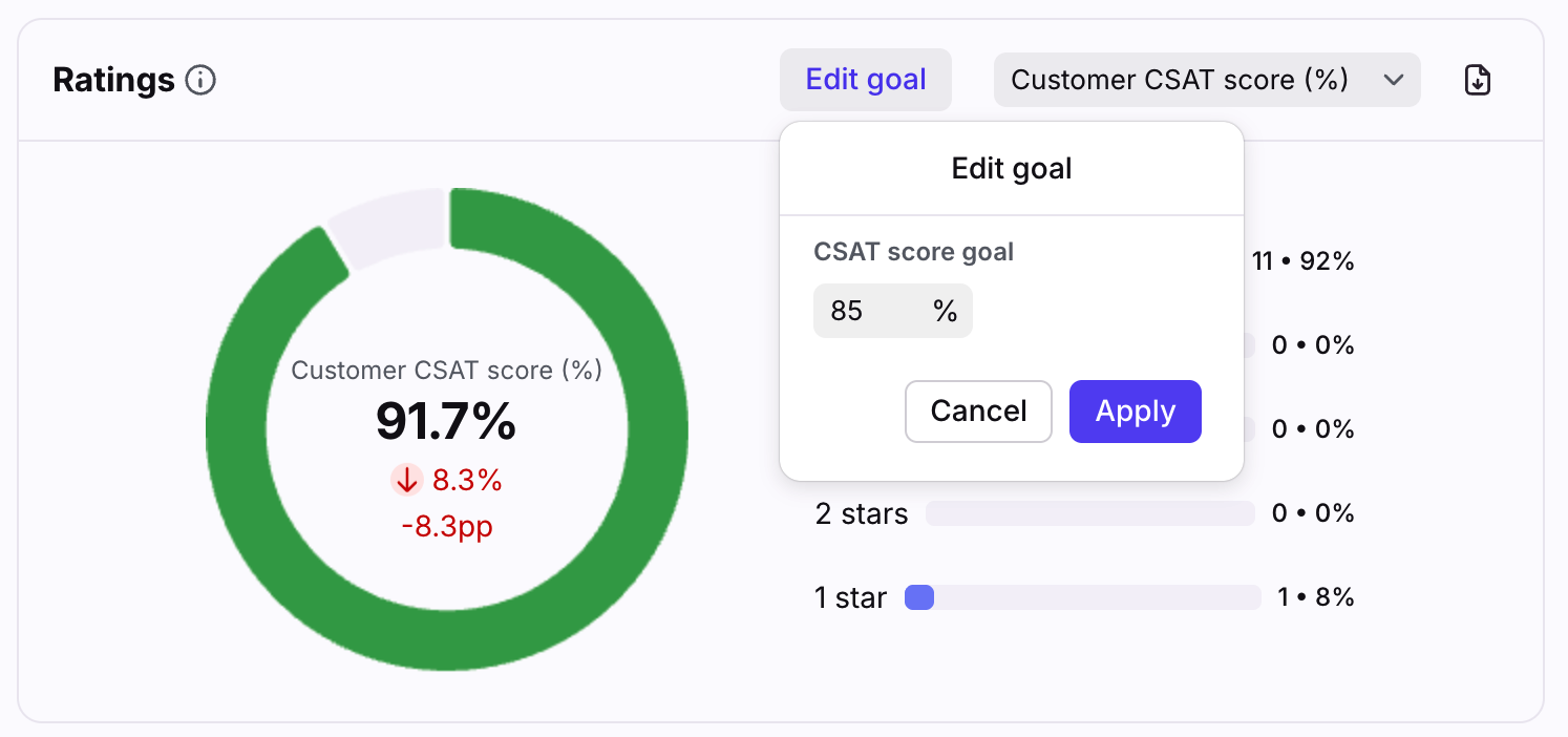
The Ratings chart shows the breakdown of your CSAT ratings and displays the CSAT score in comparison to your CSAT goal. The key is listed to the right of the chart.
Hover over the chart and click Edit goal to adjust the CSAT goal for your team. The default is 85%.
The chart displays green when the CSAT goal is met, and displays red when the goal is not met.
Click on each star rating to see which conversations were counted into the metric.
List of metrics
Customer CSAT score
Smart CSAT score
Reviews table
Features
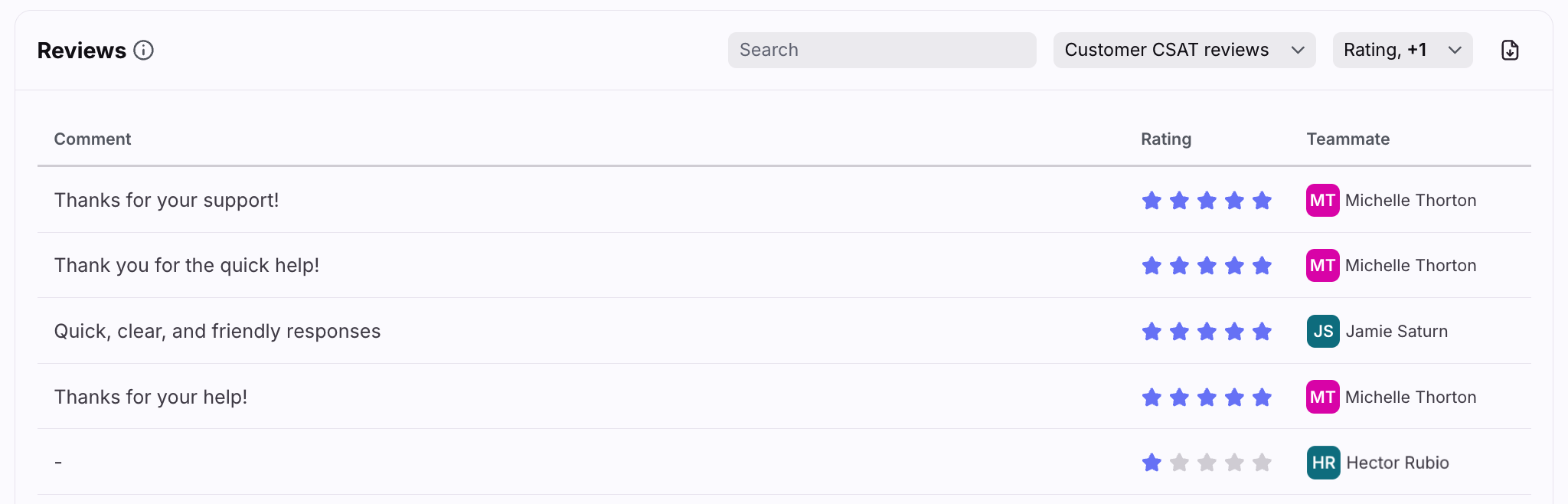
The Reviews table allows you to review customer satisfaction, identify common issues, and take action to improve satisfaction.
Use the first dropdown menu to see all reviews, customer CSAT reviews, or Smart CSAT reviews.
Use the second dropdown menu to choose the data you want to display in the table: CSAT rating, teammate, contact name, account name, date, contact email, inbox.
If a customer did not provide an email address with their rating, no name is shown.
Use the export icon to download a file containing the CSAT comment, CSAT rating, name of the teammate who received the rating, the customer name, the account name, message date, CSAT type (customer or Smart CSAT), contact email, and inbox.
Click into the Comment field of any review to see the conversation details.
List of metrics
CSAT comment
CSAT rating
Customer satisfaction over time chart
Features
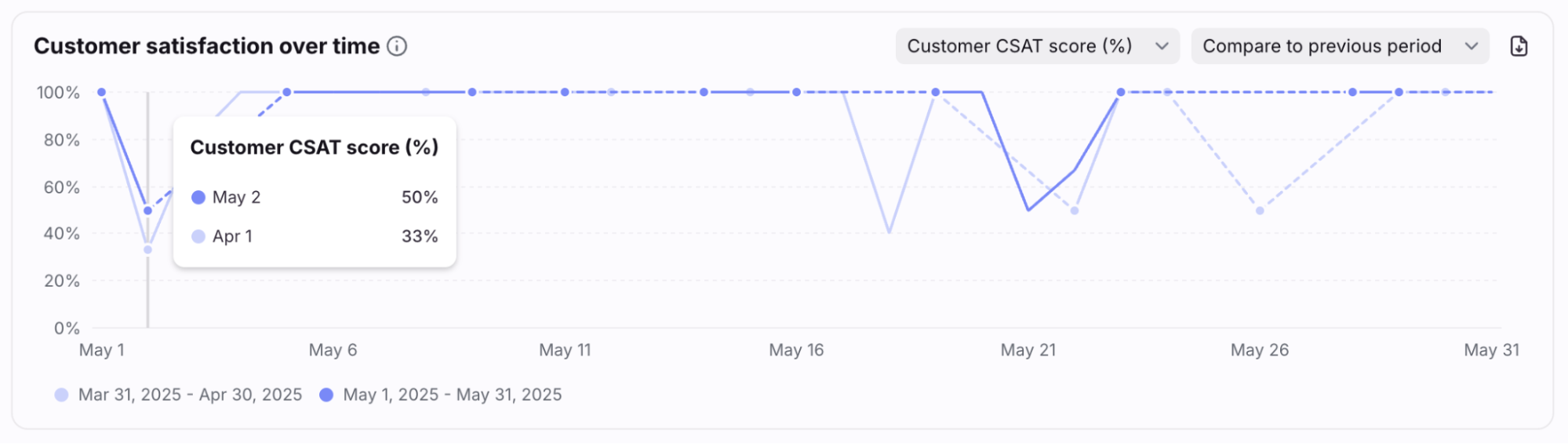
The Customer satisfaction over time chart displays your average CSAT rating over the period of time you've selected for the report. Review drops in satisfaction to identify trends over time and adapt your team processes or coaching.
Use the first dropdown menu to see all scores/ratings, customer CSAT scores/ratings, or Smart CSAT scores/ratings.
Select Compare to previous period to see the previous week's data added to the graph.
Hover over points in the line graph to see specific metrics for each time increment.
Dotted lines represent periods with no data.
Click on each metric to see the metric details and list of conversations counted in the metric.
List of metrics
Customer CSAT score
Customer CSAT rating
Smart CSAT score
Smart CSAT rating
Customer satisfaction details table
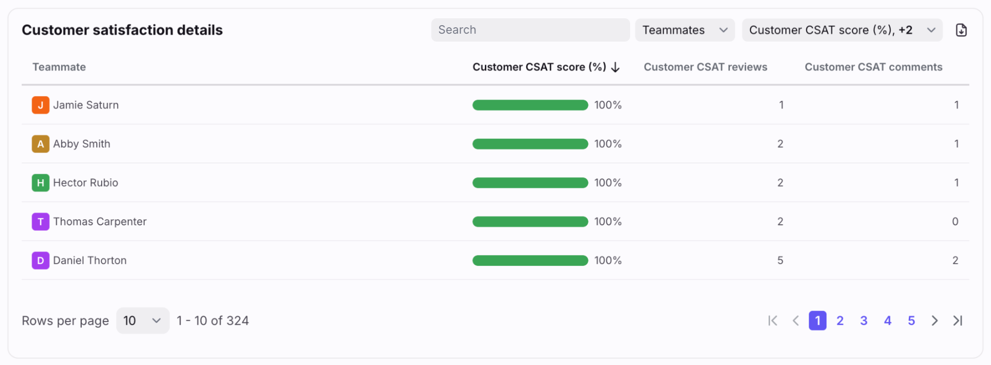
Features
The Customer satisfaction details table allows you to review satisfaction levels by teammates, accounts, or contacts. Use this data to compare performance and prioritize actions to improve satisfaction and retention.
Bar charts display green when the CSAT goal is met, and displays red when the goal is not met.
Use the first dropdown menu at the top right to group your data by Teammates, Accounts, or Contacts.
Use the second dropdown menu to select which metrics to display, listed below.
List of metrics
Smart CSAT score
Smart CSAT rating
Smart CSAT reviews
Instructions
Set up a new report view by following this guide.
Pricing
This report is available on the Professional plan or above.